“Big Pile of Wind”
 My 3 year old son said that the other morning while watching the Today Show.
It was a pretty profound statement from someone who’s been known to ask me to “Put the thing on top of the other thing under that thing that’s over there or something…”
While I don’t think I could have put it so eloquently, the “Big Pile of Wind” remark pretty much sums up what I think of Matt Lauer…
Moving on…
Okay, so now I’m going to take on the role of Matt Lauer and deliver a lot of hot air regarding my spending.
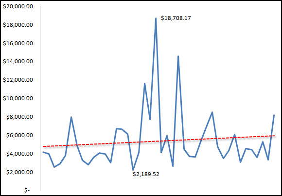
I spent the morning (okay, maybe 10 minutes) putting together a spending chart using the numbers I’ve reported here on PIAC in my monthly spending reports.
The first one was back in February 2009 and the most recent was just last month, July 2012.
A 42-month span should be enough data to show “something”, I thought, so here it is:

So the blue line represents my spending each month and the dashed red line is the trend line. I labeled the highest point and the lowest point too. No real reason for it — I just though it made the whole think look a bit more technical.
Yeah, I know, I’ve got some “mad skillz” with Microsoft Excel…
Fine, so pretty charts aren’t exactly a strength of mine…
Anyway, the red line is what I found very intriguing. Fascinating, even.
Sure, I’ll concede that I’d expected it to trend upwards. I mean, in February of 2009, we were a family of two and now there are four of us.
That makes perfect sense — day care is wicked expensive.
What I did find surprising, though, is that the upward trend is so subtle — I’d have expect a far steeper line.
If I were to omit the expenditure spikes (which were mostly due to our 2010 home renovation, I’d bet the line would be flat.
Maybe even a downward trend?
That makes me feel good as it clearly displays (charts are great!) that my spending hasn’t really grown.
My income hasn’t grown really either but that’s a whole different animal…


